
Passenger Reassurance at Euston
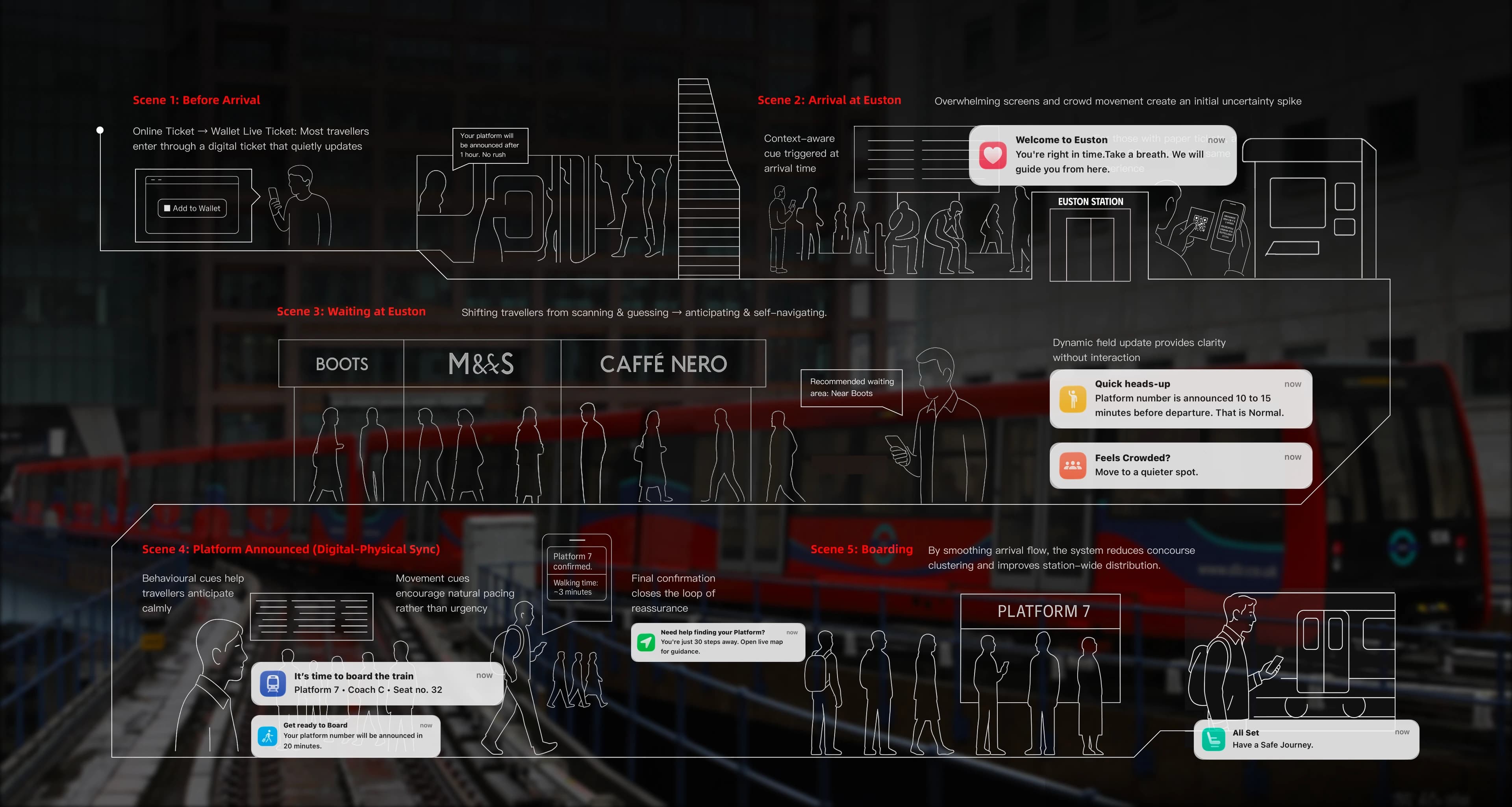
Passengers at London Euston often had access to information, but not when they needed reassurance to prepare and move. Responding to an Arup brief, our team developed Calm Guidance, a low-attention service using ticket and mobile-wallet touchpoints to deliver timely cues.
- Role
- Service Designer & Researcher
- Team
- Four-person RCA team
- Timeline
- October–December 2025 · Three months
- Outcome
- Calm Guidance service concept and mobile-wallet prototype
My contribution
I helped shape the project’s direction by turning research evidence into clearer design priorities and decisions. My role was not limited to one deliverable, but to helping the team move from a broad brief towards a more focused, lower-attention service approach.
- Research & synthesis
Combined field observations and passenger feedback to reframe the broad wayfinding brief around one critical moment: reassurance before passengers needed to move.
- Concept iteration
Developed and tested an early gamified waiting concept, revealing that additional interaction competed with the attention required for boarding.
- Final service direction
Proposed the passenger’s mobile wallet as a lower-attention service layer and developed the final guidance prototype with the team.
Context
Euston is one of London’s busiest interchanges — rail, Underground, bus, taxi, and walking routes overlap, with the station recording over 40 million entries, exits and interchanges in 2024–25. Office of Rail and RoadEstimates of station usageTable 1410 records London Euston at 40.25 million entries, exits and interchanges in 2024-25. But these systems rarely speak to each other, and information is scattered across signs, boards, announcements, and apps that don’t always agree.
Travellers sometimes find a flight easier than a train: an airport offers one clear journey, while a station often asks people to interpret many signs, boards, announcements, and apps at once. We began by asking why Euston felt difficult to navigate, especially for first-time and unfamiliar travellers in their first 20–30 minutes after arrival.
Desk research & early field scan
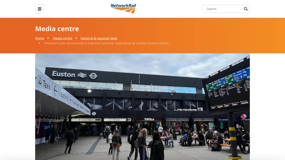
Before defining a design opportunity, we first looked for public signals around Euston: media reports, user complaints, safety concerns, overcrowding, station upgrades, and everyday passenger frustration. London TravelWatchEuston station overcrowding is putting passengers in dangerPublic passenger-watchdog signal for crowding, safety concerns and the pressured concourse environment. Official improvement plans were also addressing passenger information, boarding, and circulation. Network Rail / Department for TransportFive-point plan announced to improve customer experience at London Euston stationConfirms official attention to passenger experience, information, boarding and circulation at Euston. These signals showed that Euston was already experienced as a pressured and contested place, not simply a station with unclear signs.
We then carried out early field scans across Euston and nearby interchange moments, including the taxi loop, station entrances, escalators, concourse, and surrounding pedestrian routes. This early scan surfaced many possible problem directions — congestion, accessibility, taxi/bus coordination, confusing entrances, waiting spaces, and inconsistent information.
At the taxi loop, for example, most older and disabled travellers we spoke to said boarding itself worked — drivers put down a ramp — and that the real friction was a timing mismatch between taxis and passengers.
The value of this stage was not that it gave us the final answer. It helped us see the problem space was too broad, and that we needed a sharper service-design focus.
Public reports, reviews, and complaints showed Euston as a crowded, high-pressure station before fieldwork began.
Early field scans explored possible pain points across entrances, taxi loops, waiting spaces, escalators, and surrounding routes.
Initial framing
First frame
We first treated Euston as a wider service-system problem rather than a single signage or wayfinding issue.
What it revealed
Early mapping surfaced overlapping pressures around congestion, information coordination, construction disruption, accessibility, interchange, waiting, and emotional stress.
Why it was still too broad
This was a useful first frame, but still too broad. It explained why Euston felt difficult, without yet identifying the precise moment where design could intervene.
Field evidence
With the problem space mapped, we gathered evidence on the ground to see where uncertainty actually concentrated — combining direct observation, a passenger survey snapshot, and staff interviews rather than treating Euston as a set of isolated touchpoints.
Observations
Passengers cluster under the departure boards while waiting, watching for a platform to appear.
Many stay put once they have a spot, repeatedly checking screens and phones for an update.
A single platform announcement then triggers a sudden, one-directional surge toward the gate.
Passenger surveys
- Platform uncertainty was the strongest source of confusion.
- Most travellers checked real-time information repeatedly.
- Trust and timing mattered as much as access.
Staff interviews
We get around 450 assistance jobs a day — more during disruptions.
Passengers often don’t know where to wait or what to do before platforms are announced.
We always help, but during peaks there are just too many people.
Reframing
After mapping the wider problem space and reviewing the field evidence, the project still needed a sharper focus. The project had started near wayfinding, but the evidence showed that clearer signs alone would not address the real uncertainty.
Many travellers could physically find signs and boards; what they could not resolve was whether to wait, move, trust a screen, ask staff, or follow the crowd.
The problem became less about navigation and more about orientation in time: helping unfamiliar travellers understand what matters now, before the platform announcement forces everyone to move at once.
How the framing shifted
- Initial assumption
The problem was unclear wayfinding within a complex station system.
- What challenged it
People were not only lost; they were waiting, checking, hesitating, and reading the crowd.
- Reframed problem
How might the system reduce uncertainty before the platform announcement, without adding another app or more public noise?
Thinking Journey
The journey moved from observing fragmented service breakdowns to defining a precise moment for reassurance.
Insight shift
Not missing information. Mistimed information.
The issue was never that information did not exist. It was how, and when, it reached people — and how readily they could trust it.
Information was fragmented across signs, boards, apps, staff, and crowd movement.
Screen-checking and crowd-following were reasonable responses to uncertainty.
The design focus shifted from finding a route to feeling ready to act.
Concept iteration
We initially explored whether a light, non-competitive experience could make the unpredictable wait for a platform announcement feel calmer. Passengers would join through a QR code, enter a shared activity linked to their train, and receive official platform guidance as soon as it became available.
However, the prototype exposed a contradiction. In exploratory intercept feedback at Euston, passengers questioned whether engaging with the experience might distract them from announcements or delay their response when the platform appeared. A service intended to reduce uncertainty was asking people to decide whether it was safe to give their attention elsewhere.
Tutor critique also challenged our assumption that the problem needed another digital destination. We therefore moved away from designing an experience to occupy the wait and focused instead on protecting passengers’ attention.
Early prototype sequence
The prototype tested whether a lightly interactive waiting experience could make the uncertain wait easier until official platform guidance appeared.
- 01 QR entry
Passengers would enter from an official station touchpoint, reducing the need to discover the experience independently.
- 02 Train selection
The experience stayed linked to a real departure, with language support and the option to switch trains.
- 03 Direct platform guidance
When the platform was available, the service would move straight to instruction rather than ask for more interaction.
- 04 Quiet fallback
The “Notify me only” option became the clearest signal that reassurance could work without sustained attention.
- 05 Shared waiting
Passengers on the same train could enter a slow shared activity intended to make waiting feel less isolated.
- 06 Group presence
Small avatar and message cues explored whether shared presence could reduce uncertainty without becoming competitive.
Principles carried forward
- Low attention
Reassurance should not require passengers to stay inside a separate experience.
- Familiar touchpoint
Essential guidance should appear through something passengers already use.
- Ready to act
The service should help people prepare for movement without pretending the platform decision is under their control.
Design opportunity
The iteration shifted our goal from occupying the wait to helping passengers feel ready to act. The opportunity was a calm reassurance layer delivered through familiar travel touchpoints, using timely cues without overstating certainty.
How might we offer gentle, non-intrusive guidance that helps unfamiliar travellers feel ready to act while waiting for their platform — without requiring a new app or sustained attention?
Service response
The team proposed a station-run guidance layer that extends the existing ticket into the phone Wallet — the Wallet is only the delivery channel, not the product. It runs on rail data the station already has, so there’s no new app to download and nothing new to learn.
It’s a supporting layer, not a replacement for staff, signage, or announcements — a behavioural guidance layer, not a structural fix.
How it works
- Detect
Reads location (geofencing), time to departure, and the live rail feed to sense when a traveller is likely to be uncertain.
- Decide
A simple logic engine judges whether a small nudge is needed — and if so, when and what kind.
- Respond
Delivers the smallest possible help as a calm Wallet update or notification — reassurance, never a command.
Wallet as the service channel
Instead of asking travellers to download another app, the concept extends the existing ticket into the phone Wallet. The Wallet becomes a familiar, low-friction channel for small contextual nudges before and during the station journey.
Testing the service moment
We tested the guidance layer as a short service scenario, focusing on whether a small reassurance cue could reduce hesitation before passengers decided where to wait or when to move.
Reflection
This project taught me that service design in a public system is not always about creating a new touchpoint. It is often about finding the smallest credible intervention inside an existing system, and making the moment before action feel less ambiguous.
As part of a four-person RCA × Arup team, my service-design contribution focused on turning field observations into the service logic: locating the moment of uncertainty, framing the passenger experience, and shaping how a digital–physical guidance layer could support both travellers and the wider station.
One limit I would address next: Calm Guidance runs through the phone Wallet. We discussed a printed alternative for passengers who don’t use smartphones, but it did not reach the final concept. A version that works without a phone is the next thing I would test, with the older and disabled passengers we met at the taxi loop.
- It’s a behavioural guidance layer, not a structural fix — it doesn’t eliminate crowding or replace signage and infrastructure.
- It depends on digital access, and is meant to complement long-term station redesign, not substitute for it.
- Its value is in reducing stress and hesitation at the moments that matter most.
References
Numbered references are included only for external context and public factual claims. Field observations, passenger responses, staff comments, and design decisions are treated as project evidence rather than external references.
- ^ "Estimates of station usage". Office of Rail and Road. 2025.
- ^ "Euston station overcrowding is putting passengers in danger". London TravelWatch. 2024.
- ^ "Five-point plan announced to improve customer experience at London Euston station". Network Rail / Department for Transport. 2024.