CodeArts — Huawei Cloud
CodeArts is Huawei Cloud’s one-stop DevOps platform — requirements, code hosting, code checks, pipelines, builds, testing, and release in a single production line, drawn from three decades of Huawei’s own engineering practice and sold as a cloud service to external teams.
- Role
- UI Designer
- Team
- Huawei Cloud · UCD
- Timeline
- 2021–2022
- Outcome
- Platform visual system, multi-device specification, iF Design Award 2023
Context
CodeArts is one platform sitting underneath more than twenty different tools — code check, build, testing, pipelines, deployment, and the rest of the delivery lifecycle. It did not start under that name: it launched as DevCloud, Huawei’s internal engineering practice, packaged and opened to external teams, and by 2021 had grown into the whole toolchain this redesign covers.
Two problems made the platform inconsistent. Each service team shipped on its own schedule, while the existing design specification had fallen behind technical needs and was interpreted differently across teams. Navigation depth, hierarchy, toolbar logic, and interface density all varied from tool to tool, so users had to relearn the interface as they moved across the platform.
That is what this redesign had to fix: not how any one screen looked, but one shared, up-to-date design standard to replace the old one, which no longer fitted the platform — a rebrand from DevCloud to CodeArts, and the visual and structural system underneath it, across desktop, mobile and tablet.
The hard part was never one screen; it was keeping one language coherent across many independently operating teams.
The change, across the surface
Not a single screen — the whole working set. Dashboards, boards, pipelines, code review: the old DevCloud logo and flat grey interface frame, replaced everywhere by the same CodeArts identity and layout rules.
- Before · DevCloud
Nine screens, nine slightly different headers, toolbars and card treatments — each service team’s own reading of the brand.
- After · CodeArts
The same nine screens on one identity, one header pattern, one card language — recognisably a single product.
Starting point
The diagnosis matched eight recurring complaints collected independently from platform users. I grouped them into four design directions and translated each into buildable strategies for service teams.

Layout doesn’t surface what matters — hard to find what I care about.

Want clearer priority — everything competes for attention.

Want something that actually feels designed, not just functional.

Want it to look fresh, clean, and interesting.

Colours don’t feel harmonious.

Lacks a technical, engaging feel — doesn’t match my role.

Interface elements feel dated, not refined.

Want it to behave the way things do in real life.
Unify navigation structure and style across every service.
A systematic spec and component set, with a wider colour hierarchy.
Use colour blocks and cards to show information at a glance.
Strip unnecessary lines, shadows and decorative fragments.
Standardise table and toolbar patterns across every service.
Move every service onto one shared component library.
Run conformance checks on both design and engineering.
Add illustration and motion to individual components.
My contribution
I was the primary UI designer for the platform’s visual redesign, working alongside a UX designer and under senior design guidance. I authored a substantial part of the visual specification and contributed to the component library that carried it, DevUI. The specification spanned many modules; five of them — colour, shadow, corner radius, typography, and spacing — are shown here, issued across desktop, mobile, and tablet.
The harder part was keeping the standard alive across independently operating service teams: reviewing implementation, resolving edge cases, and updating rules when real products exposed gaps. Across the work, I delivered 50+ high-fidelity prototypes and reviewed other teams’ outputs against the evolving standard. The specification was mandatory for every service team. Before release, designers, myself included, reviewed each implementation pass/fail, annotating failures by dimension such as spacing and colour values and tracking each issue to closure.
What the job actually involved
- Authoring
Writing the standard: many modules of visual guidelines, five shown here, plus contributing to the component library that made them usable.
- Specifying for scenarios
The same token does not behave the same on a phone as on a wide desktop. Colour, shadow and radius were specified per device scenario, not once globally.
- Governing
Reviewing other teams’ output against the standard, and extending it where a product had a legitimate reason the spec had not anticipated.
Five modules from the specification
Selected modules from a broader specification, each with usage rules and worked examples for teams applying the system across products and device scenarios.
What changed
A post-release survey, run by a separate UX research team and shared with the project team, indicated improvement over the previous interface across six measures.
User questionnaire — reported improvement over the previous version
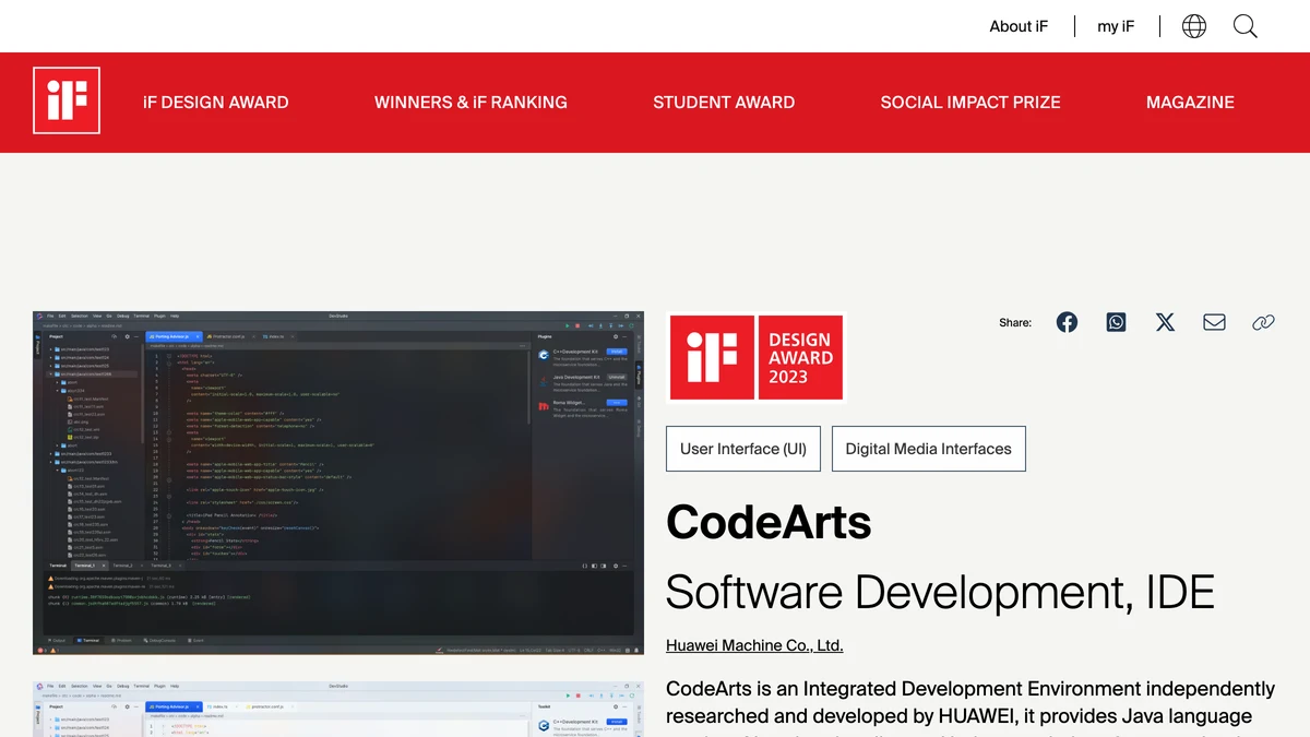
Project materials from the period also reported 770+ new platform registrations. CodeArts IDE later received an iF Design Award in 2023iF DesignCodeArts — iF Design Award 2023 winner listingOfficial award listing, category Software Development / IDE, crediting the Huawei Technologies design team.. I was credited as part of the official design team; my direct work included the DevPocket mobile interface and the wider platform UI system, rather than the IDE desktop product as a whole.
Four years on
What held
CodeArts is still live and actively developed by Huawei Cloud, which makes it one of the few places in this portfolio where I can check, years later, whether the decisions actually held. Some did. The navigation hierarchy — one consistent pattern across first, second, and third level, for every service — survived. It solved a problem that had been getting worse, not better, as the platform grew.
What had to evolve
Some did not, and I found out while I was still there. Corner radius broke first: a single global value that read correctly on a card looked wrong at the size of a nested popup layer, so the spec had to grow a per-layer rule. Tab labels came back from users as hard to read in real working conditions, not in review. In both cases, a rule written by the central design team was corrected by real use — the normal way this works, not a failure of it. Whether a system was any good shows up years later, when someone has to add something you never planned for.
Reflection
Flow taught me to build a system inside a product. CodeArts taught me the harder version: maintaining a standard between products, across teams with their own deadlines and reasons to deviate. Defining the standard was only half the work; the other half was review, negotiation, and amendment.
It also gave me the first evidence that the useful question is not whether a design is right on the day it ships. It is whether other people can keep using it after I leave — fixing what was wrong, and extending it to cases nobody planned for. It’s the question I still start with, on work that has nothing to do with software.